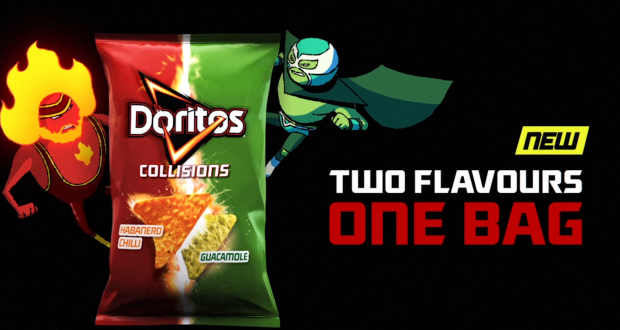
1) What key conventions of an advert can you find and what are the connotations of each one?
Picture of the product(Doritos) make us remember the product and how it looks.
Logo is vibrant, bold and on the product also reminding us of the type of product
The Colour Scheme is black,red,green,white,and yellow. The green and red show different favours and how recognisable the packet of Doritos are.
Anchorage Text show how the made a unique blend and how it is new
The central image of the 2 luchadors connote how the Doritos are spicy but also cool
2) For each convention, write about how this appeals to a target audience.
The Doritos logo shows the company and make the audience familiar for the brand
The central image is of the product and the audience might want to buy it
The Colour Scheme is bright and vibrant;may appeal to kids;is very bold and stands out
Anchorage Text shows how it is new and different and unique to other products
3) What is the USP (unique selling point) of the product and how do you know?
The unique USP of the product is the mix of two different flavour in crisp
Find a an example of a print advert for EACH of the following:
1) A clear brand identity

2) A shocking or controversial idea
 3) An emotional connection to audience
4) An innovative or ‘different’, subversive concept (e.g the porcupine advertising VW car)

5) A foreign advert that you can understand despite the language barrier
Finally, write what the USP is for each advert.
AthleteChild to show remorse
The Logo and colour scheme
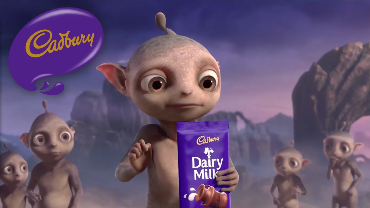
Weird idea of the creatures
Coca Cola
No comments:
Post a Comment