
1) Write an analysis of the WaterAid advert above using denotation, connotation and analysis. What does the advert communicate to the audience?
Denotation
In this advert print I can see ; a child with blue over worn clothes and is sitting on a chair, the typography is also communicated as the colour is white and is bold and stands out which represents a problem. I can also see the Charity logo which is to show where to donate and has a rain drop. The hut and muddy area in the background and a limestone rock .
Connotation
The choice to make the typography white could have connotations to clarity as white seen as pure and clean. Also the size of "Dig toilets Not graves" shows the importance of the message .The logo shows blue as water and how crystal clear it is and links back to the child as he is wearing a blue top and might suggest he isn't in a developed country and a lack of water.
Analysis
The colour pallets is very dull because the use of browns and dark blue are washed out. This advert is targeted to people who are fortunate and want to help others. It shows other how lucky they are and how they should think about how others feel around the world. It is eye-catching as the child looks unhappy and the consumer might feel sympathy.
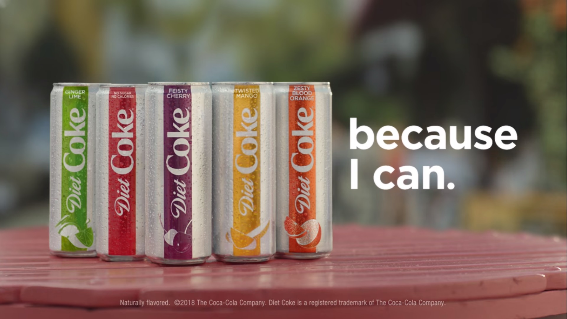
Denotation
In this advert print I can see ; five coke-cola cans on a table. The colours of the cans are vibrant, eye-catching and bright. At the bottom of the can are the fruits. The background it could be a park or a garden as it is blurred. The typography is white, bold and stand out. At the bottom is the company and shows that the coke has been trademark.
Connotation
The choice to make the typography white could have connotations to the drinks as they are clean, replenishing and refreshing. The producers might have made the colours of the drinks energetic to make the consumer buy it as it is striking and easy to see. At the bottom of the can are the fruits, the producers also done this to show the flavours.
Analysis
The colour pallets is very neon like because fruits are fresh and tasty. This advert is targeted to everyone as it looks like a refreshing beverage and show the flavours of the drinks.
No comments:
Post a Comment