Wednesday, 23 October 2019

Camerawork - photo storyboard

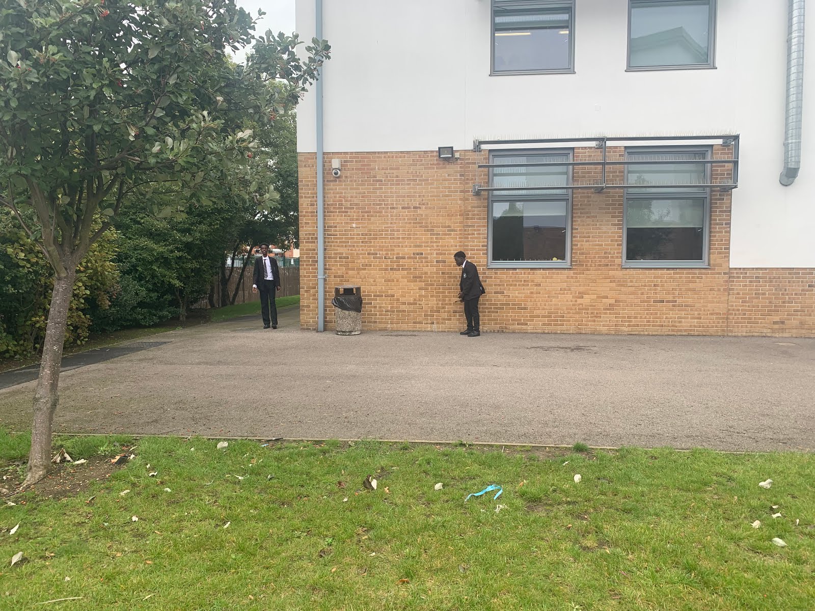
The establishing shot is used to set the scene and introduce the location.We used this to show the audience about where the story is set

We used an over-the-shoulder shot to show dominance as it is a high angle shot. Usually this shot is used to show a conversation. This creates tension as his eyes are closed.

A medium close up as we can see the head and shoulders. We can clearly see their emotions and is also at a low angle to see the power of the bully to the victim.

Another high angle shot to show dominance and superiority but we used a long shot to show a little bit more of the setting.

This extreme close up shot shows his eye and how it creates suspense and tension as it might show sadness or something more unpredictable

This medium close up is at a low angle to show how powerful he is and his dominance. We can see his expressions and emotions of fear.

Tuesday, 15 October 2019

Camerawork Analysis

https://youtu.be/CMbI7DmLCNI

1) Three camera shots:

The opening long shot shows the boy riding his bike in a corridor in a hospital. We are following the child and can confirm see his is young and see he is a child.

The extreme close-up we can see the child's expression and emotions. He is startled but also puzzled at the sight of the two twins in front of his face.   
We can see him breathing fast which make the audience feel that the twins are supernatural and unorthodox.

The over-the-shoulder shot at 0.44 shows the child looking at the twins and recognises who they are and how the were massacre in the same corridor it is also a medium close-up which allows the audience to see the monochromatic faces of the twins.

2) Two camera angles:

The unusual angle shows how they are supernatural and creates suspense and surprise the audience and show how fearful this twins must be.

Also it is low shot shows the power of the two twins and have dominance of the little boy. It also makes sense as the little boy is on a bike that is low.

3) Analyse the camera movement:

The camera movement in the beginning of the scene is slow, steady and getting further away from the child. The atmosphere is calm as the child is riding around the corner. The smooth track or dolly shot then becomes faster building tension (0.16-0.23) which makes the audience feel like he is riding faster.

Then the camera zooms in a out of the twins deceased on the floor and goes into the twin emotionless faces. The makes the audience feel sympathy for the little boy as he witness the the twins dying and reappearing out of no where.

Also the camera abruptly stops and becomes hand held and shaky so it creates a unnerving atmosphere and show the audience that it is extraordinary 


Wednesday, 9 October 2019

Mise-en-scene Stranger Things analysis

Setting:
There is a laboratory which detonates to experiments. Its also night time which can demonstrate that a nightmare is coming. After this we are set in a house in the suburbs which shows an causal neighbourhood. After we get to a gloomy and bare road which detonates a demonic atmosphere

Costume: 
In the first scene the man is wearing a lab coat conveys that he is a doctor, professor or science. Also he is wearing a tie which conveys professionalism. The children are wearing causal clothes which shows that they are ordinary children. The teenage girl is wearing a nightgown which links back to night time.

Lighting: 
The scarlet and vivid title at the start shows that the show could be a thriller as the colour red is linked to danger. The dim flashing lights in the warehouse detonates exigency and something has gone wrong like a supernatural power or electrical cut this create the effect on the audience of tension and suspense. Also the lights are rapid which creates even more tension. The use of street lights and bike light illustrates the time of day. 

Props:
There is a watch on the one of the children's hand which illustrates that he is productive. They are playing a board game which shows that they are children and they are bored in the 1980s as now we use technology. Riding bikes also indicates that they are youth. The coats of the children show it might be cold outside. His sister use of a phone signifies that she older and might be a teen.

Tuesday, 8 October 2019

'Blog feedback and Learner Response - October 2019


Daniel GCSE Media blog feedback – October 2019
Work expected:
·         Introductory questions
·         Key Concepts film poster analysis
·         Fruit bowl task (Photoshop)
·         Denotation and connotation
Post this in a new blogpost on your Media blog called ‘October 2019 - Blog feedback and Learner Response’ then complete the LR tasks/questions below.

WWW:
·         Fantastic start to this two-year course! You have contributed really well in lesson with your opinions in group discussions, please keep this level of engagement up.
·         All work published and posted to a decent standard
·         Great choice of film poster for your fruit bowl task

EBI:
·         Attempt all extension tasks to secure your minimum grade or higher
·         Ensure you are adding Media terminology to any blog post you publish
·         Check the layout / theme of blog because some of your text is hidden because of the colour of your font and blog colour background

LR:
Complete and improve the following work urgently. See below of what is missing:
1. First blog questions (8 & 9) are incomplete
2. Change blog theme / background / font colour so that it is more presentable. See the blog standards post for guidance 

LR 1:

9) Why was the casting of Jodie Whittaker a significant moment in the history of Doctor Who?

It is a significant moment in doctor who as this is the first ever female doctor which shows gender equality. 


Tuesday, 24 September 2019

Denotation And Connotation


1) Write an analysis of the WaterAid advert above using denotation, connotation and analysis. What does the advert communicate to the audience?

Denotation
In this advert print I can see ; a child with blue over worn clothes and is sitting on a chair, the typography is also communicated as the colour is white and is bold and stands out which represents a problem. I can also see the Charity logo which is to show where to donate and has a rain drop. The hut and muddy area in the background and a limestone rock .

Connotation
The choice to make the typography white could have connotations to clarity as white seen as pure and clean. Also the size of "Dig toilets Not graves" shows the importance of the message .The logo shows blue as water and how crystal clear it is and links back to the child as he is wearing a blue top and might suggest he isn't in a developed country and a lack of water.

Analysis
The colour pallets is very dull because the use of browns and dark blue are washed out. This advert is targeted to people who are fortunate and want to help others. It shows other how lucky they are and how they should think about how others feel around the world. It is eye-catching as the child looks unhappy and the consumer might feel sympathy.
Image result for advert
Denotation

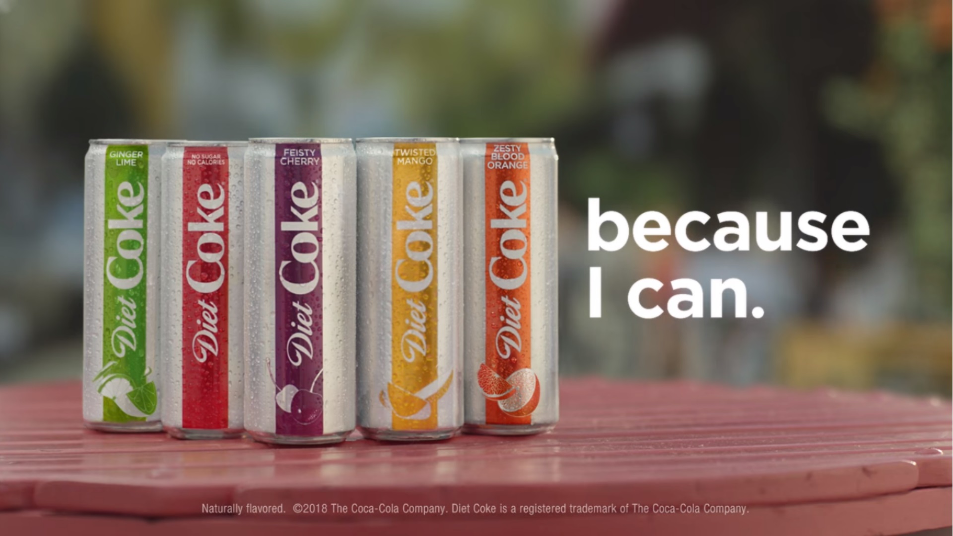
In this advert print I can see ; five coke-cola cans on a table. The colours of the cans are vibrant, eye-catching and bright. At the bottom of the can are the fruits. The background it could be a park or a garden as it is blurred. The typography is white, bold and stand out. At the bottom is the company and shows that the coke has been trademark.

Connotation
The choice to make the typography white could have connotations to the drinks as they are clean, replenishing and refreshing. The producers might have made the colours of the drinks energetic to make the consumer buy it as it is striking and easy to see. At the bottom of the can are the fruits, the producers also done this to show the flavours.

Analysis
The colour pallets is very neon like because fruits are fresh and tasty. This advert is targeted to everyone as it looks like a refreshing beverage and show the flavours of the drinks.


Tuesday, 17 September 2019

Key Concepts Homework Blog Task

                     Image result for endgame poster


Language

The main actors are all over the cover showing them clearly. The title is bold and eye-catching as it has a vibrate, prominent and celestial colours. The date is striking from the bottom of the poster and the actors names are at the top. 

Industries 

The film was produced by Marvel Studios and they are known for making superhero movies which have been running for over 10 years. It is produced by Kevin Feige who is a very popular producer and has created the likes of Guardians of the Galaxy (2014), Black Panther (2018) and Avengers: Infinity War (2018)  . It is also the most successful movie at global box office and has broken multiple records.  

Audience

The target audience are teenagers to young adults who are fans of superheroes or love action, comedy and sci-fi movies. The layout, colours and font looks playful and serious at the same time so it could also be for younger children.

Representation
These film poster is very diverse with multiple genders and many different races. This suggest than it is equal and can be for anyone to watch. It shows that everyone is equal and can enjoy the same things. 
  

Fruit Bowl

Coursework: Statement of Intent

Daniel Statement of Intent S a s a s a S a s a s a S a s a s a S a s a s a S a s a s a S a s a s a S Introduction Horror film title: S...